
Why Most Landing Pages Fail and How to Build One That Actually Converts
If you have ever run ads, launched a product, or tried to generate leads online, you already know one thing. Getting traffic is not the hardest part anymore. The real challenge begins after someone clicks.
That click is expensive. That attention is short. And that visitor is already comparing you with ten other options in their mind.
This is exactly where most businesses lose.
Not because their product is bad. Not because their offer is weak. But because their landing page simply does not convert.
Let’s break this down in a real and practical way.
The Real Purpose of a Landing Page
A landing page is not just another page on your website. It is not meant to educate broadly or showcase everything you do.
It has one job.
Convert.
Whether that means getting a signup, booking a demo, or making a purchase, everything on the page should support that single goal.
In fact, many founders and marketers make a critical mistake. They try to include too much information, too many links, and too many actions.
But clarity always wins over complexity.
As one discussion on Reddit pointed out:
“If you cannot explain what you do in seconds, it will not convert”
That insight alone explains why so many landing pages underperform.
Why Most Landing Pages Do Not Work
Let’s talk honestly about what goes wrong.
1. Weak or Confusing Headline
Your headline is the first thing people see. If it does not clearly answer what you do and who it is for, you lose them instantly.
Generic lines like “We help your business grow” do not work anymore. People want specific outcomes.
2. Too Many Choices
Multiple buttons, multiple directions, and multiple offers create confusion. When users are confused, they do nothing.
3. Focus on Features Instead of Problems
Users do not care about features at first. They care about their pain.
A good landing page speaks directly to that pain and positions your offer as the solution.
4. Poor Structure
Even a beautiful design cannot save a poorly structured page.
From community insights:
“Most landing page problems are clarity problems, not design problems”
That means your message matters more than your visuals.
What Actually Makes a Landing Page Convert
Now let’s flip the script and talk about what works.
Clear and Specific Value Proposition
Within the first few seconds, your visitor should know:
- What you do
- Who it is for
- What result they will get
No guessing. No scrolling required.
One Goal One Action
A high converting landing page focuses on a single objective.
Whether it is lead generation or sales, everything should guide the user toward one clear action.
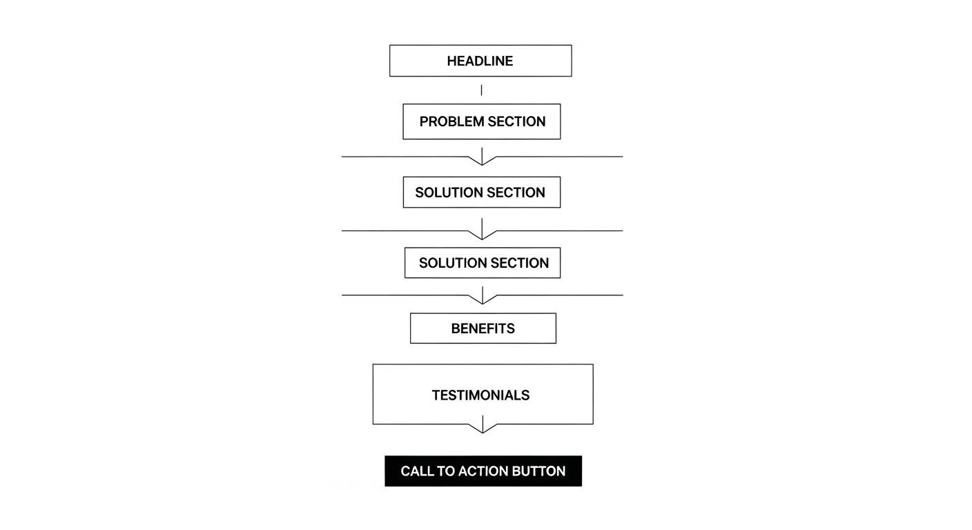
Strong Visual Hierarchy
Your page should guide the user naturally.
- Headline grabs attention
- Subheading builds interest
- Sections build trust
- Call to action drives conversion
This flow is not random. It is strategic.
Trust Building Elements
People do not convert unless they trust you.
This includes:
- Testimonials
- Case studies
- Client logos
- Guarantees
These elements reduce hesitation and increase confidence.
Speed and Mobile Experience
A slow page kills conversions.
Modern users expect fast loading and smooth mobile experience. Even small delays can increase bounce rates significantly.
The Role of Strategy in Landing Page Design
Here is something most businesses overlook.
A landing page is not just design. It is strategy.
It is a mix of psychology, marketing, and user behavior.
That is why professional services like StartDesigns Landing Page Design Services focus on more than just visuals. They combine:
- Data driven decisions
- Conversion focused layouts
- SEO friendly structure
- User behavior insights
According to their approach, every element from layout to copy is optimized to guide users through a smooth journey and increase conversions.
This is the difference between a page that looks good and a page that performs.
Key Elements of a High Converting Landing Page
Let’s break this into a simple structure you can follow.
1. Hero Section That Hooks Instantly
This is the most important part of your page.
It should include:
- A strong headline
- A clear subheading
- A visible call to action
If this section fails, the rest of the page does not matter.
2. Problem and Solution Section
Clearly define the problem your audience is facing.
Then present your solution in a way that feels natural and relevant.
3. Benefits Over Features
Instead of listing features, explain how those features help the user.
For example:
Instead of saying “Advanced analytics dashboard”
Say “See exactly what is working and improve your results faster”
4. Social Proof
This is where you build credibility.
Real testimonials and results make a huge difference.
5. Clear Call to Action
Your call to action should be:
- Visible
- Simple
- Action driven
Avoid vague buttons like “Submit” or “Click here”
Use something meaningful like:
- Get Started
- Book Your Demo
- Try It Now
Trends Shaping Landing Pages in 2026
Landing pages are evolving quickly.
Here are some trends that are working right now:
Personalization
Pages that adapt based on user behavior perform better.
Minimal Design
Clean layouts with focused messaging improve engagement.
Interactive Elements
Subtle animations and interactions guide users naturally.
Data Driven Optimization
Continuous testing and improvements based on real data lead to better results.
Modern agencies integrate these trends into their workflow to ensure better performance and ROI.
The Cost of Ignoring Landing Page Optimization
Many businesses invest heavily in ads but ignore their landing page.
This creates a major problem.
You pay for traffic but fail to convert it.
A well optimized landing page can significantly increase your conversion rate, which directly improves your return on investment.
Even small improvements in conversion can lead to huge revenue gains over time.
Final Thoughts
A landing page is not just a design asset. It is your conversion engine.
It is where interest turns into action.
If your page is not converting, the problem is rarely traffic. It is usually clarity, structure, or strategy.
Focus on:
- Clear messaging
- Single goal
- User focused design
- Continuous optimization
And if you want to skip trial and error, working with experts who understand both design and conversion psychology can make a massive difference.
Because at the end of the day, a great landing page does not just look good.
It performs.